Click to learn more about author Steve Miller.
In my April blog, I reported an update on violent crime in Chicago from January 2001 through March 2018. This is a continuation of analysis I’ve regularly conducted, born of concern for the staggering 50+% increase in Chicago homicides in 2016 from 2015, along with an only slightly less disturbing 20+% jump in 2016 overall violent crime. Sadly, these developments provide grist for Chicago critics, yet followed a steady decline in crime starting in the 1990’s and affirmed by hard data starting in 2001.
The daily crime data I use is readily accessible from the City of Chicago. Add in several adjunct sources, and you have the foundation for monitoring Chicago crime over time.
I download the crime data several times a week, submitting them to R wrangling processes. The data are a week in arrears and depict slightly inflated figures. Once the curated data are in place, I perform simple analyses using queries and frequencies, ultimately visualizing the results.
If Chicago gets a grade of F for its 2016 crime, 2017 would be given a D — a noticeable improvement, but still a long way to go. And the first six and half months in 2018 grade out to C, again steadily better, but still not where they need to be. To earn a B, levels will have to return to those in 2015; an A will only be attained when levels surpass the lows from modern reporting.
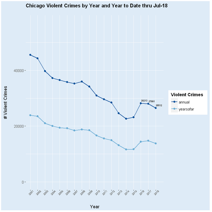
What follows are a series of tables and graphs delineating the trends in Chicago homicide and violent crime from 2001-2018. Data for January through the middle of July are used to forecast final 2018 figures. The tools include Microsoft Open R version 3.4.4 along with Jupyterlab Beta Release Series Version 0.32.1.
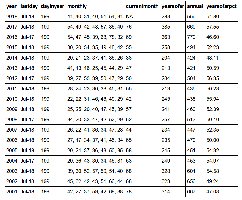
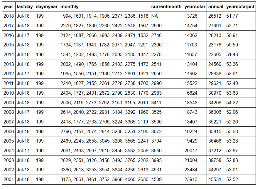
Below is a busy table summarizing homicides in Chicago from 2001 through year-to-date 2018 (a week in arrears). The lastday column represents the 199th day of each year. The 199th day is the last available for 2018 as of Jul-26, and may represent Jul-18 or Jul-17, depending on the leap year. The monthly series represents the homicide numbers for Jan-June, as well as those in Jul through day 199. yearsofar sums the monthly list, while currentmonth is the total for Jul in years 2001-2017. annual represents the final yearly figures for 2001-2017 and the time series forecast for 2018. yearsofarpct is yearsofar as a percent of annual.
Over six months into 2018, the improvement in yearsofar from 2016 and 2017 is apparent, leading to a final forecast of over 100 less homicides in 2018 than 2017, and over 200 less in 2018 than 2016. Alas, even two years with significant year over year improvements does not get back to the 2015 level — a stark reminder of just how bad 2016 was. At this point, 2018, with 288 homicides as of day 199, looks a lot like 2012, with 284. Wouldn’t it be nice if the final 2018 figure looked more like 2012!
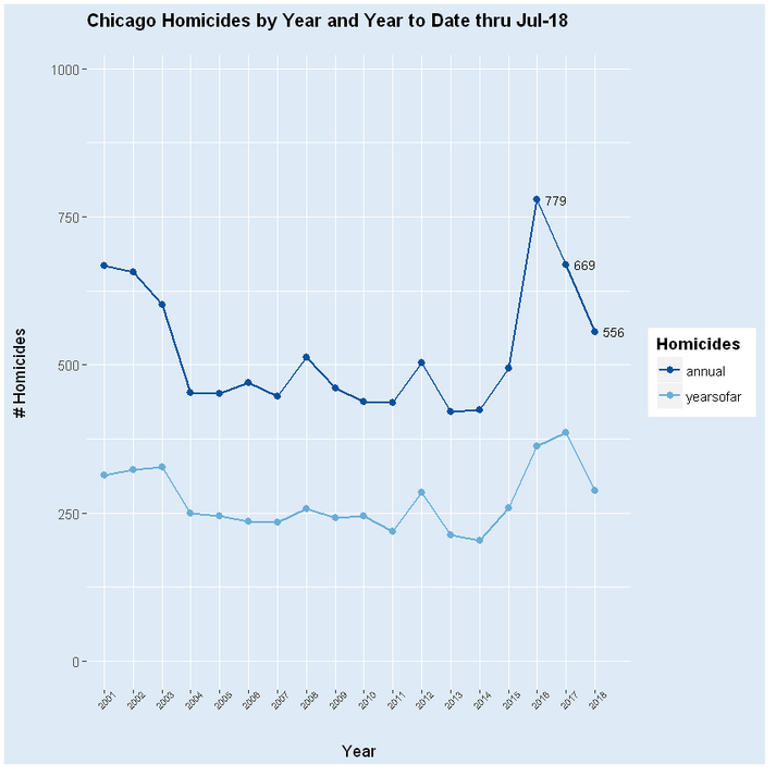
The following graph outlines annual homicides along with yearsofar as of day 199. annual tracks yearsofar pretty well, supporting the forecast of 556 for 2018. It’s visually apparent that even with significant two-year reductions in homicides, Chicago still has a way to go before reaching the 2015 level.


