Click to learn more about author Bree Baich.
During the holidays, we seek opportunities to slow down and spend time with family and friends. It’s a time for traditions that pull us together. One such tradition for my family is watching National Lampoon’s Christmas Vacation. This year was no different. During a scene where Frank Shirley asks Clark Griswold for help with a speech, I was reminded that there is enormous value in communicating complex ideas through an everyday lens, especially when it comes to data and analytics.
“Are you the one who’s working on that non-nutritive cereal varnish?… I’ve got to give a speech to a trade group. I’d like to mention it. Right up a brief summary and have it to me by the end of the day…layman’s terms. None of that inside [bleep] jargon that nobody understands.”
Clark’s non-nutritive cereal varnish is so complex that in an earlier scene – while describing it to a peer – his colleague politely changes the subject. If Clark had shared a story to explain how varnish improves the experience for cereal connoisseurs, maybe his peer would have been intrigued rather than underwhelmed.
Everyday examples (as Mr. Shirley said, layman’s terms) make analytics findings easy-to-understand – which is crucial when you consider the expectation of on-demand, data-driven, decision making has become the norm. While the narrative is key, pairing a story with value-added data is how you’ll drive action.
Here are three traditional techniques data storytellers use to add value and capture an audience within a story.
#1 Have a Purpose
To succeed at something you need a goal – every goal is tied to a purpose. It’s the reason you’re doing it in the first place. Data within a story needs a purpose to meet the goal you set for an audience.
I love Excel. The ability to color code cells, sort columns, auto sum groupings, etc. makes budgeting a breeze. But there’s a time and place for spreadsheets. Projecting one on the big screen during an executive meeting while asking them to make tough decisions based on the information, isn’t it. Rows and columns will never move someone to action because it’s too difficult to quickly decipher what’s important.
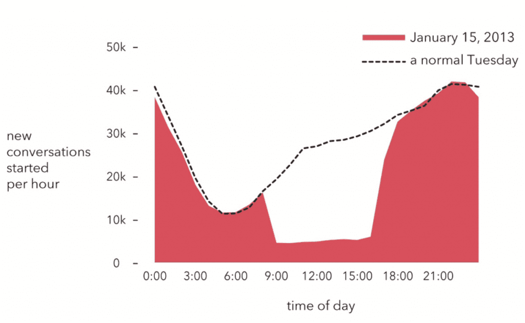
Instead, think purpose-driven results. I borrowed an image from Christian Rudder, co-founder of OKCupid, to illustrate a better option.
Image credit: Dataclysm: Love, Sex, Race, and Identity–What Our Online Lives Tell Us about Our Offline Selves –Christian Rudder
In preparation for the launch of OKCupid’s blind date app, Rudder’s team tried something unusual. For one day, programmers turned off user’s profile images on the website. For his book, Dataclysm, he created a compelling image to illustrate user’s responses to the site’s actions – revealing a significant plunge in traffic. Presenting something like that to a room full of executives would certainly highlight potential adoption struggles a blind dating app might have.
While there’s obviously a database filled with hundreds of thousands of data points from this moment in time, Rudder only used data which added value to his story. If the narrative were about the ratio of men versus women who declined to interact that day, his data (and supportive image) would be different.
As an aside, if an image will standalone at any point, make sure to add context. Without the paired narrative in the book, one could assume a multitude of reasons traffic dropped on that date. Give data a purpose.
#2 Make it Easy to Understand
If an audience doesn’t understand the data, they won’t engage with it.
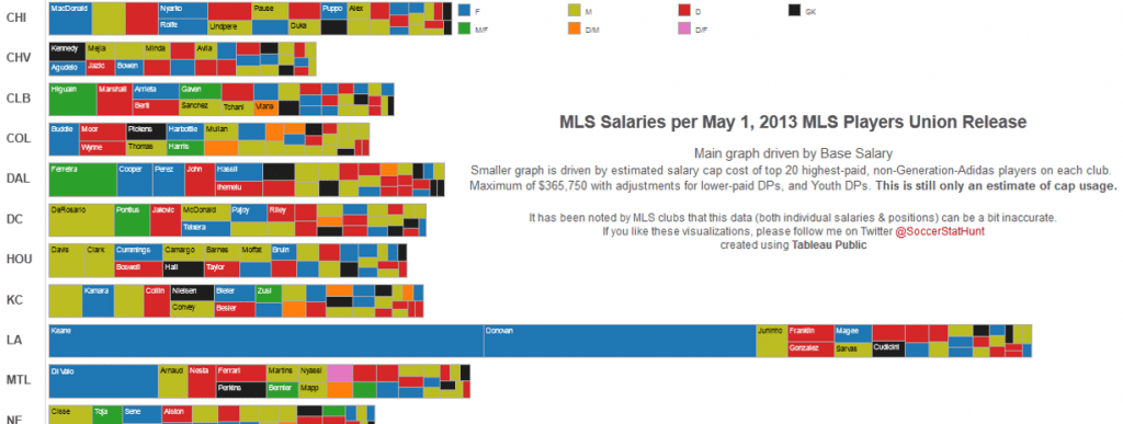
As a seasoned soccer mom, I know quite a lot about the sport. However, when I stumbled onto the following image, I was at a loss. What position is gaining the lion share of salary? And who seems to be undervalued? Unless you’re versed in the art of reading tree charts, you’re probably scratching your head as well.
Source: Junk Charts
Every story has a target audience. When that audience is pushed aside, it’s easy to fall into the trap of using technology for technology’s sake. And while a tree chart’s value is realized through interaction, if the audience isn’t experienced with that style of charting they’ll likely become confused and do nothing.
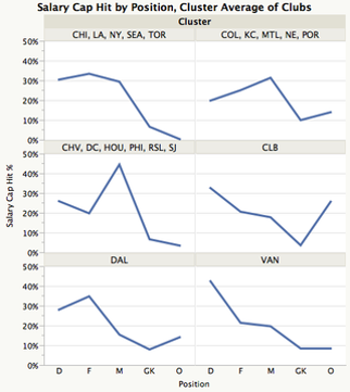
For clarity, the folks at Junk Charts started chipping away at the branches. Instead of stacking the results, they’ve grouped them into clusters. Now, you can quickly see goalkeepers are one of the lowest paid positions for MLS players. It doesn’t seem fair when you consider they have the crucial job of preventing the opposing team from scoring.
Source: Junk Charts
Bottom line, the goal is to present data in a way the target audience can easily interpret and understand.
#3 Include Only What Matters.
It’s natural to feel compelled to share everything; including the path you took to get there. Don’t. It impedes decision making and at the same time, unleashes a host of unnecessary questions.
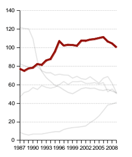
Start with the end in mind – what action or outcome is expected? From there, highlight data points that paint a clear picture. For example, here’s a before and after image compliments of Gregor Aisch, via www.vis4.net. Aisch is educating readers on the importance of keeping it simple while highlighting what’s important.
Source Vis4
At a minimum, the chart on the left could encompass five story lines. Of those five, which one needs a decision? Whatever the answer, those are the findings an audience’s eyes should be drawn to. Notice the revised image on the right. Aisch changes 4 of the 5 lines to gray, therefore, making the red line pop on screen.
It may seem as though the additional lines are no longer necessary. However, if you’re making a comparison where one result needs to stand out, this technique is genius. The audience’s focus is directed towards a specific outcome while the comparative data strengthens the case.
Preparing for follow up questions is always a good idea, just steer clear of creating gaps in understanding by keeping things simple.
Traditions are something we count on to bring us closer together. By creating traditions for how you’ll deliver results, an audience begins to count on your ability to communicate in a manner that promotes understanding.
What are some of your favorite traditions for sharing data?


